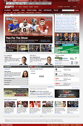
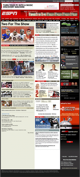
ESPN has launched a redesign beta of the site to Insiders to preview before the site is officially launched for everyone. Here is a side-by-side comparison with the current frontpage and some highlights.
- Simplified navigation and layout
- Fewer, less intrusive advertisements
- A new scoreboard with live, auto updates
- More accessible with less Flash
- Lighter page weight and better performance
- Personalized scores, headlines, and navigation
What other people are saying:
- ESPN.COM is counting on less clutter and more advertising options to bolster revenue…Instead of inundating visitors with its intense coverage of every major sport from the get-go, something that the company now believes can drive away certain fans, ESPN.com is moving in a less-is-more direction, at least on the home page — NY Times
- The redesign brings a cleaner user experience, something I love, and also more naturally brings ESPN’s video content to users, another plus — FanSection
- Nice. Very nice…much cleaner and more efficient…pleasantly shocked…looks so friggin’ great…the scoreboard, columns, top stories, many of the same elements but simply improved — Small White Ball
- I have spoken glowingly about ESPN and ESPN.com previously – I don’t feel bad being sour about ESPN Beta… too much like a magazine and too little like a sports site — Ryan Spoon (founder of beRecruited)
- a wider, more prominent video player… tons of links to additional videos…site’s background is a darker hue of red…featured columnists are promoted with larger modules…soliciting user feedback — PaidContent
- the revamp will be video-centric, including a larger video player and a new navigational scheme — Paid Content interview with John Skipper (ESPN EVP Content)
- the principal change isn’t a surprise: a greater emphasis on video — MediaDailyNews
- they have done away with banner ads on the home page — Louis Gray
- The new look goes live in a month or so — Steve Clancy
- the site is substantially better looking…not sure that the new look brings much more than just that, a new, fresh look — Cheap Seats
- At first glance, the site is aesthetically pleasing… [but] it’s really hard to find any of the “breaking news” content you might be looking for — AwfulAnnouncing


